Personal Design System
Having worked with established design systems throughout my career as both a designer and developer, I wanted to build my own system tailored to the needs of my personal projects. The goal was to streamline my prototyping process, ensure consistency across designs, and create a reusable foundation that could evolve over time. Having color palettes and text styles in variables has made it super easy and quick to switch out styles.
The challenge
While prototyping ideas for personal projects, I often needed repeatable UI components and consistent styles. Instead of starting from scratch each time, I decided to build a personal design system that could speed up my workflow while supporting visual consistency.
Key problems to solve
- Cover common UI needs with modular, style-driven components
- Ensure that system styles (color, text, spacing) are easily adjustable via tokens and variables
Research
To guide the structure and methodology of my system, I explored several established design systems, focusing especially on the Fluent Design System, which I’ve used extensively in previous work and Figma community resources. In particular the Pixelmatters Design Template, served as a solid starting point.
These references helped me define best practices for color usage, component states, and naming conventions.

Ideation phase
I began by customizing and expanding on the base template from Pixelmatters, gradually building a robust system as I iterated through various personal projects. Key features of the system include:
- Component Library: A wide range of UI elements with full-state permutations (e.g., buttons with hover, focus, and disabled states)
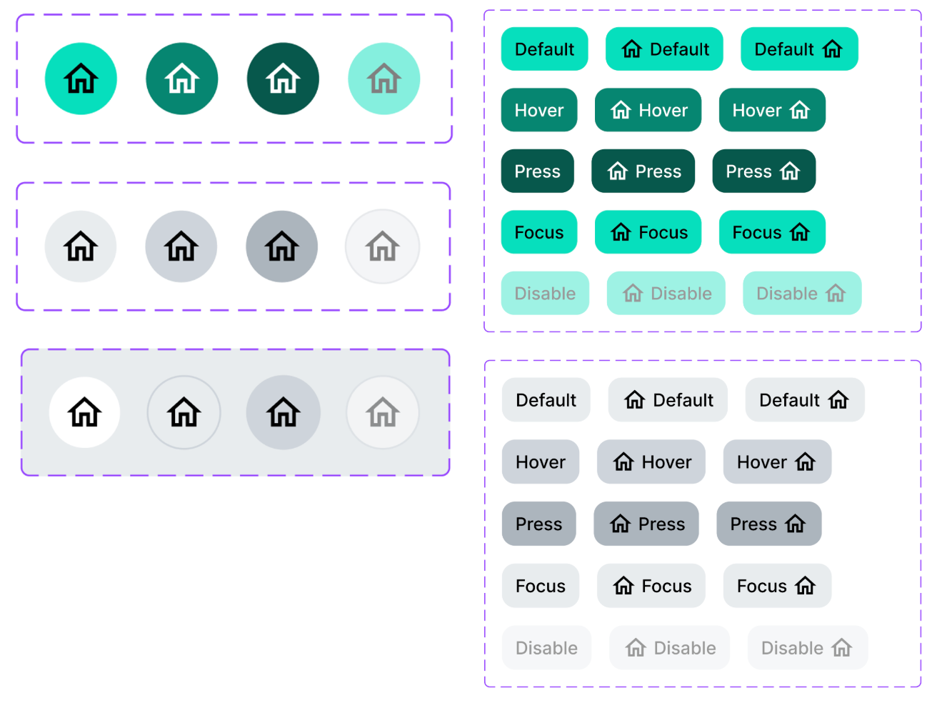
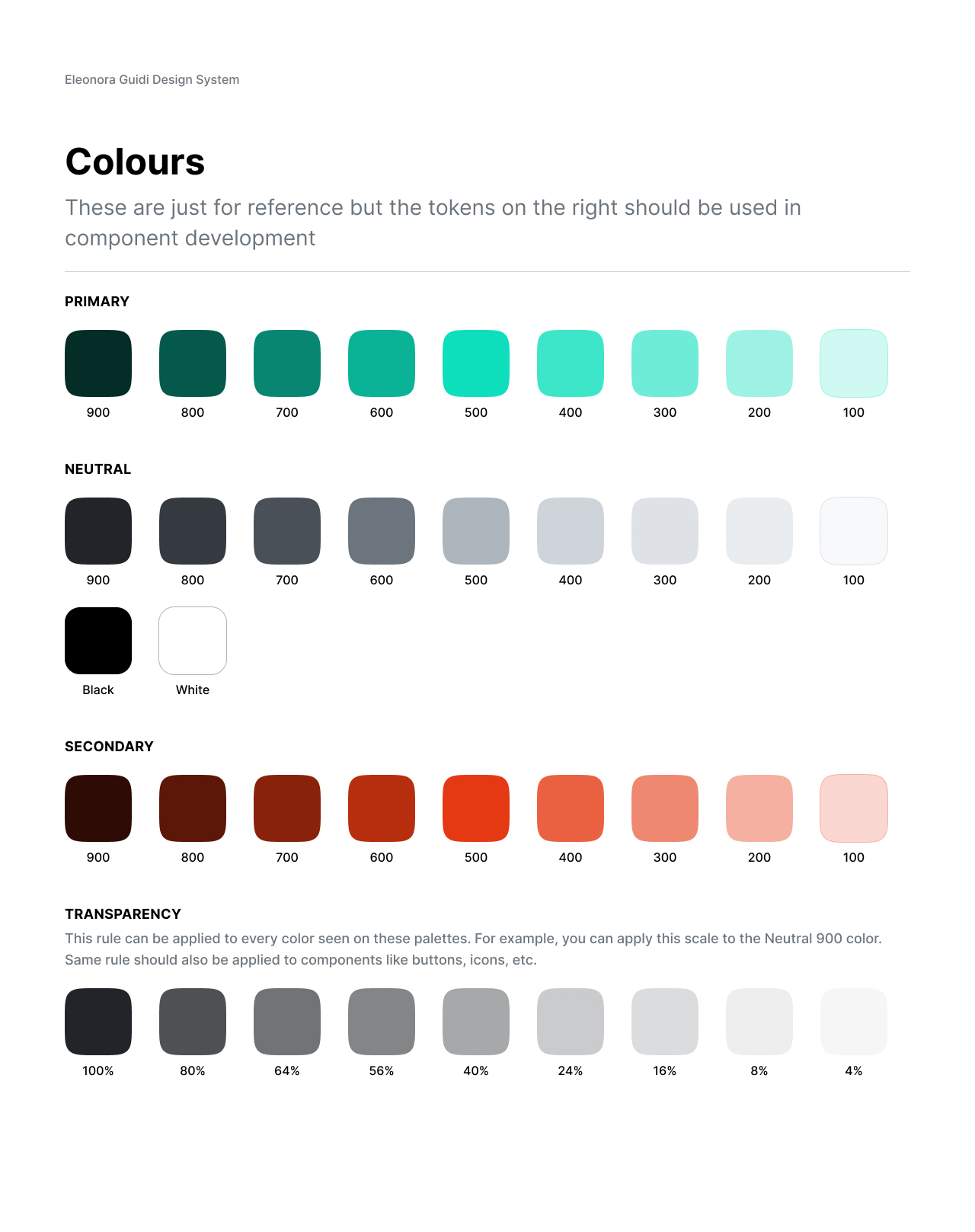
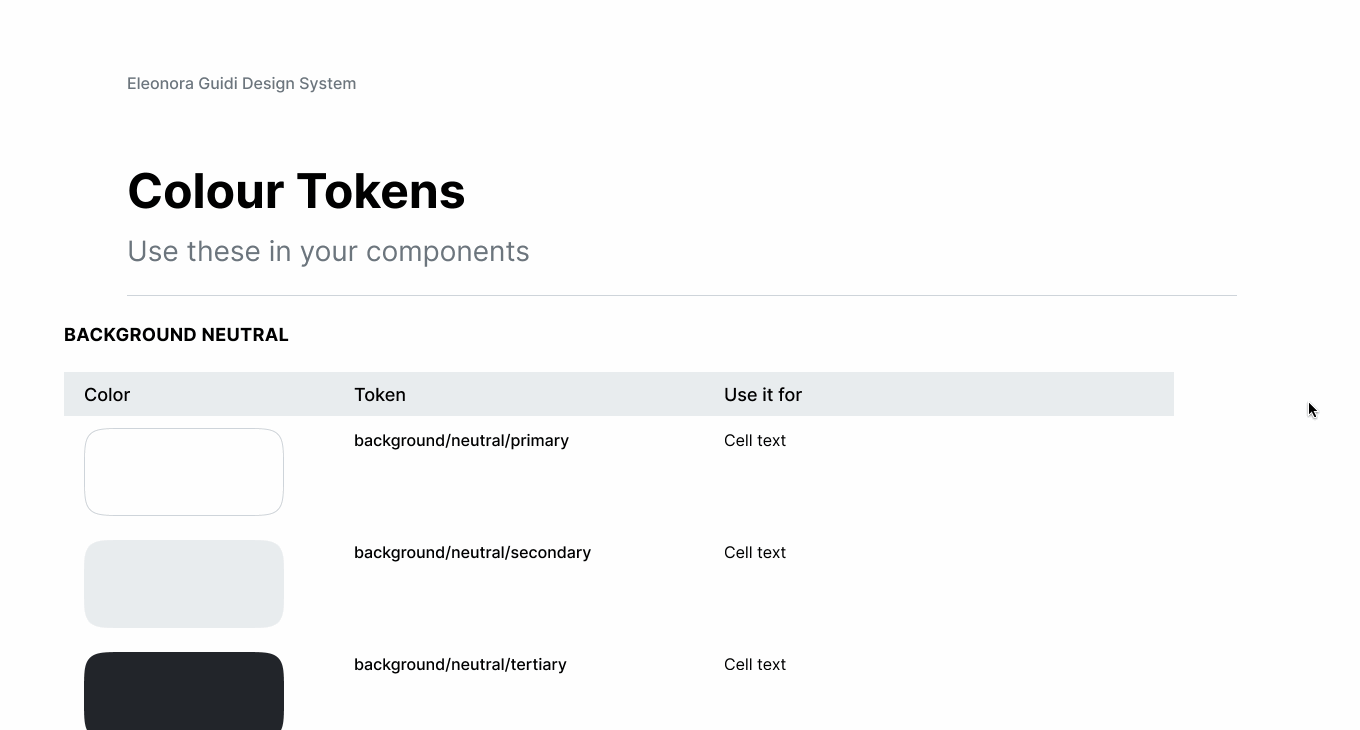
- File Variables: Set up using primitives for raw color values and semantic tokens for contextual use (e.g., primary button, text-on-background)
- Scalable Text Styles & Grids: Defined for both mobile and desktop layouts
This structure enables rapid theming—for example, updating the color palette globally takes just a few minutes thanks to the variable system.
Reflections and learning
Even on a small scale, building a design system proved incredibly valuable. It reinforced the importance of:
- Design tokens and variables as a backbone for scalability
- Consistency across projects, reducing repetitive design tasks
- Modular thinking, which allows components to be reused and adapted across different interfaces
Having a centralized system gave me a clean foundation for experimentation while keeping visual and interaction patterns consistent.
Looking forward
As I continue developing new personal projects, I plan to:
- Expand the component library, with dedicated elements for both mobile and web interfaces
- Add prototyping components (e.g., low-fidelity placeholders, interaction states) to speed up early-stage concepting
- Introduce dark mode support, which is currently limited by Figma's free plan and lack of mode switching
- Consider splitting the system into platform-specific libraries for better scalability and clarity
This project has been an excellent hands-on exercise in system thinking and design operations. I see it as a living resource: constantly evolving and improving with each new use case.
Interested in working together on a similar project?
Let's Talk