User Flow Study
This user flow exercise was centered around designing an early-stage concept with the core interaction for a mobile grocery delivery app. The objective was to map a clear, intuitive process for how a user would place a grocery delivery order via mobile, including multi-store selection and streamlined checkout.
The challenge
The following project brief was provided for this exercise:
Scenario
You're a UX designer at a startup that is making a new mobile grocery delivery app (Instacart is a competitor). It's the beginning stages of designing the app. You need to plan out the flow for how a user submits a delivery order, which you will then present to your team.
Task
Create a user flow for the entire process of creating and submitting a grocery delivery: selecting a nearby store, adding food products to the cart, checking out, and choosing a delivery time.
Key problems to solve
- Support for multi-store ordering
- Maintain simplicity and usability throughout the flow
Research
I began by conducting a competitor analysis to understand how existing platforms handle similar flows. Along with Instacart, I reviewed apps such as: Oda, Meny and Wolt. Wolt's store selection UX stood out as particularly effective for handling multiple store options, inspiring part of my ideation.
Ideation phase
Drawing from my research, I designed a user flow that prioritized clarity, flexibility, and minimal friction:
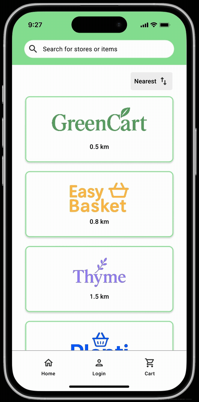
- Homepage: automatically shows nearby stores sorted by distance.
- Store View: selecting a store reveals its product catalog.
- Cart System: users can shop from multiple stores. The cart view includes both a global cart overview and individual store carts.
- Checkout Flow: collects contact information, allows delivery day/time selection, supports saved user profiles for faster checkout including credit card payment details.
Reflections and learning
The most complex part of this exercise was designing for multi-store cart management, which introduces several UX challenges around navigation and cognitive load. I learned that:
- Cart visibility and access points are critical. I ensured that users could reach the cart from both the homepage and within any store, maintaining a sense of control and continuity.
- Reducing cognitive friction is key. The ability to save user profiles and auto-fill contact details in future sessions supports a smoother checkout and encourages repeat usage.
- Store-specific vs. global cart views must be balanced. Offering both gives users clarity without overwhelming them with decisions.
This exercise sharpened my understanding of how micro-decisions in user flow—like where and how to display cart contents—can significantly impact the user experience, especially in scenarios involving multiple entities like stores.
Looking forward
This exercise highlighted the importance of designing scalable, flexible user flows, especially when dealing with layered interactions like multi-store ordering. Moving forward, I’d like to build on this work by looking into optimizing for repeat use: I’d like to investigate how loyalty features, reordering past purchases, or personalization could further reduce friction and increase retention. This project reinforced that clear information architecture and thoughtful navigation design are essential for reducing user effort in complex systems. I’m excited to continue evolving this concept and applying these learnings to future design challenges.
Interested in working together on a similar project?
Let's Talk